You are using an out of date browser. It may not display this or other websites correctly.
You should upgrade or use an alternative browser.
You should upgrade or use an alternative browser.
-
 This site is sponsored by Lang & Potter.
#StripesAreBack - A look at the new kit
- Thread starter Argy1e
- Start date
Even if Carlsberg did ranting they couldn't beat our X isle !
But agreed, the darker green is OUR green now
But agreed, the darker green is OUR green now
The Doctor":1vigw4xn said:Actually, there has been research done on goalkeepers' shirts and it was found that by wearing bright/fluorescent coloured kits goalkeepers appeared bigger and more distracting to approaching attackers. That is why Petr Cech always used to wear really bright coloured kits.
Fair one Doc, I can see the logic in that too :think:
OK, I hearby have no official position on the visibility/invisibility of goalkeeping shirts :lol:
Can I be the first to say how underwhelmed I am with the 2047 kit. It is the wrong shade of green, the stripes are too thin, the sponsors name is too high up and the badge is too large. Also, the sponsors name is the wrong font compared to the wording on the stadium signs so will clash. I will not be buying and nor will my family or their kids.
My goodness, can we not copy this chain every year the kit comes out. As long as it is green and is not sponsored by Rotolok why waste time complaining.
My goodness, can we not copy this chain every year the kit comes out. As long as it is green and is not sponsored by Rotolok why waste time complaining.
Tony_Flags":3p8icbvh said:Can I be the first to say how underwhelmed I am with the 2047 kit. It is the wrong shade of green, the stripes are too thin, the sponsors name is too high up and the badge is too large. Also, the sponsors name is the wrong font compared to the wording on the stadium signs so will clash. I will not be buying and nor will my family or their kids.
My goodness, can we not copy this chain every year the kit comes out. As long as it is green and is not sponsored by Rotolok why waste time complaining.
Marty is that you what league are we in in 2047
Stonehouse Mike":3m7c95cn said:Even if Carlsberg did ranting they couldn't beat our X isle !
But agreed, the darker green is OUR green now
Leave it!! one isn't the messiah, one's just a very naughty boy. One volley was fired and one volley was returned, let's leave it there, a score draw. It's a road we don't need to go down again now, nor hopefully ever again.
G
Greenskin
Guest
X Isle":2n5bnol5 said:Kevin_Dacombe":2n5bnol5 said:Since 1886.....14 years of "tradition".X Isle":2n5bnol5 said:"British racing green 'branding' "- a translation for the hard of stubborn.....
Argyle green. The colour by which the club has been identified by since the turn of the century. Encompassing most, if not all, of the waking consciousness of anyone under 25 (i.e. the growing section of support, distinct from the dinosaurs, namely those closer to extinction).
We only ever are what we are recognised as being.
Ian bandies around 'branding' like it's a dirty word. It's usually accompanied by 'London' with reference to the group in the most successful board in Argyle's history who were based in the capital. T'was they who introduced the darker shade, heralding our most successful period (boo hiss eh :roll: )I've always found the use of the word/s as snidey and not a little 'yokel' in it's sneering dismissiveness of any 'witchcraft' from 'them up country'.
It made us distinctive, it made us identifiable. Even more so now Yeovil have emerged. British Racing Green (as it's equally [perversely] negatively referred to) is associated with British excellence, the spitfire, the Mini and the Landy.
So yes, it's 'only been' 14 years, so what? It's what we're now associated with, it's all a growing proportion of the fanbase knows.
Branding isn't a dirty word, it's not witchcraft from furriners up London village :roll: It's there to create a distinct brand identity, which we have.
All been done to death before so it's a tangent we don't need to go down because it'll never be resolved. I just couldn't sit on my hands while Ian opened up another of his cans of 'yokel brew' and started shaking his fist at those pesky metal birds again.
There are two sides to every argumentand my flip side of 'branding bad/flipping shades willy-nilly good' is that a unique brand identity in the modern world is priceless, we toss it away to keep a few old crusties happy at our peril.
Nuff said.
Didn't realise that board were in situ when we finished fourth in the second tier a few times or reached the FA cup semi final or the two semi finals in the league cup.Wearing that snotty old traditional green as well.Everyday's a schoolday.
For those arguing about kit colours and stripes
http://www.historicalkits.co.uk/Plymout ... Argyle.htm
Of the kits shown dark green was used between 1899 and 1949 and the first striped (black and green) was in 1973
http://www.historicalkits.co.uk/Plymout ... Argyle.htm
Of the kits shown dark green was used between 1899 and 1949 and the first striped (black and green) was in 1973
tagz":309cvtkk said:For those arguing about kit colours and stripes
http://www.historicalkits.co.uk/Plymout ... Argyle.htm
Of the kits shown dark green was used between 1899 and 1949 and the first striped (black and green) was in 1973
But the 'Greens' (sic) used from 2001 are totally different from the (real) Greens used from 1899-1949.
2001-2002 is hardly 'Green' at all. Can't believe the majority want that, can't believe that some on here think that is our heritage.
It's indeed an inconvenient truth Tagz but I'd really like for this not to open up here. Today, this thread, is about the first pics of the new shirt. The shade, the design, the sponsors, all were decided upon long ago.
Ian knew exactly what he was doing when he 'towel flicked' me earlier, but by replying in kind by wedgying him onto the hook on the back of the door honour is restored.
Let's leavehim it there ;-)
Ian knew exactly what he was doing when he 'towel flicked' me earlier, but by replying in kind by wedgying him onto the hook on the back of the door honour is restored.
Let's leave
Ottawa Green":pdxi7jth said:ewww bright
Love it...finally a shirt I will buy
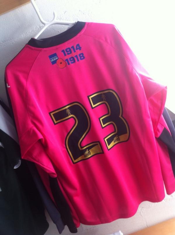
X Isle":21cznq04 said:Nice to get a first look at how the Legion logo looks :thumbup:
Bit of an up and down day for Luke though. Given the club captaincy, then given that shirt
Won't miss him in a goalmouth melee will you!!